 SudhaData & BI Addict
Sign up to receive latest insights & updates in technology, AI & data analytics, data science, & innovations from Polestar Analytics.
Editor’s Note: Resolve all your queries about how the Pharmaceutical and Lifesciences industry will profit from data visualization. Learn about use cases, applications, implementations, and dashboards for the pharmaceutical industry.
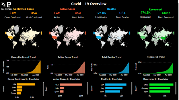
Humans are visual beings – this is something we keep hearing. But in case you’re wondering if this is really true. Take a look at the infographic below and what if the data was presented like this Cases confirmed: 2M in the USA and Active Cases are 1.4M. and so on.
What do you think would’ve been more effective? Clearly: The Infographic. So, let’s take a data visualization journey to understand the need for and importance of data visualization in pharma, the multiple types of dashboards, and their applications.
But before we go into the types of dashboards and visualizations, let’s take a step back and look at why data visualizations are needed for the pharma industry. Though you might be bored of hearing this, COVID-19 has changed the way people look at the pharmaceutical and life sciences industry.
They are expecting rapid responses in vaccine development, lower costs, and more. For all of these to happen it is important to bring transparency and visibility into the operations not just for sales and marketing but also the supply and value chain such that the operational efficiency of the entire organization goes up.
According to McKinsey, Advanced analytics can help pharma companies improve their EBITDA by 45-75%. And though many pharma companies have made significant investments in people, projects, and data, they are unable to understand the granularities in the data with the relative value it presents. And though they are looking to establish Centres of Excellence (CoE) they are unable to move out of the legacy systems and implement innovation throughout the entire organization.
But if you’re thinking about what the use of such analytics adoption would be, here are some stats for you:
In Manufacturing Supply Chain, Analytics can help with the:
In Commercials and Finance, Analytics can help with:
And, these are just the tip of the iceberg, every aspect of the pharma supply chain can be improved and impacted with analytics. If you’re interested to know more about Analytics use cases for Pharma you can keep scrolling as we will talk about analytics examples in different parts of the pharma value chain. But why are we talking about analytics when we are talking about visualization? It is because we go into the interiors and the façade of a building you need to talk a little about the foundation and the plan. Only for a building with well-designed construction, you can see great exteriors and interiors.
Now that we’ve spoken about the need for analytics adoption and how it can help, let’s take a look at how a clear visualization for life sciences and pharma would look like:
85% of health executives acknowledge that technology has become an inextricable part of the human experience. Even Data Visualization has become an essential tool for revealing insights buried in complex data even in pharma and also bioinformatics. Though we are not going deep into the data visualization for biopharma, we can talk about the multiple ways in which Data visualization helps pharma and life sciences in their operations. In addition to the applications and uses we also talk about a few KPIs that can be used by pharma experts in their dashboards. Please note that the KPIs list is not exhaustive but just a small subset.
1. Transforming care & vaccine management
In Healthcare, continuity of care is important and is a critical focus for companies. Right from analysing the bed spaces to improving the patient experience for healthcare companies and to Inventory and distribution management of vaccines for pharma companies, data visualization can help in creating detailed dashboards for optimizing hospital resources and managing the distribution and administration processes of vaccines.
Some of the KPIs that can be used on dashboards about care and vaccine management are:
2. Supply Chain management
Disruptions in manufacturing, logistics, and supply chain management have become more common after the pandemic and companies are always looking for ways to reduce them. But because lack of visibility into inventory and spend management, and poor master data management make decision-making and insights a tedious process. As such pharma giants can reinvent their supply chain to keep monitoring their KPIs and shift to automatic reporting.
Some of the KPIs that can be used by supply chain experts in their dashboards:
3. Internal Resource Improvement
Pharma consists of many nodes w.r.t. both the manufacturing and production processes which are updated with a lot of sensors that are monitored in real-time. Such sensors and processor data can be analyzed at regular intervals to identify major sources of loss or safety issues for a root cause analysis. By analysing the downtime and safety flags at multiple production levels and facilities to find and eliminate any recurring issues.
Some of the KPIs that can be used for measuring improved resource allotment are:
4. Improved clinical trials
80% of US Clinical trials fail to meet patient enrolment deadlines. With effective data visualization, you can keep a track of critical points of study and progress of the data. With dashboards, you can see real-time insights on the trial’s progress, summarize results instantly with key KPIs you are tracking for the trail, track potential risks, and iterate reports based on newly updated data without the need to create the same from scratch.
Some of the KPIs that can be used in these dashboards are:
5. Financial Impact analysis
The financial impact of scenarios can be linked with advanced analytics metrics to visualization applications like Power BI, Qlik, Tableau, etc. to showcase metrics that can’t be traditionally shown in visualizations. You can drill down your data to granular levels to identify new sources of revenue and perform cost-impact analysis with compelling dashboards.
Some of the KPIs that can be used in the measurement of financial impact in financial dashboards are:
Though these are just a few of the topics wherein analytics can help the pharmaceutical industry, in reality, once implemented all of these insights can help executives make decisions faster. In some companies, the implementation of data visualization can help them reduce their reporting time from days and hours to minutes and seconds reducing the time lag in decision-making. But still, companies face issues with the implementation: 39% of healthcare manufacturers struggle to scale up digital initiatives beyond the pilot phase and 49% have complications integrating their legacy systems according to research by Tableau. It shows that they are struggling with internal adoption and change management for visualization implementation which we can help with.
If you’re interested to know more, you can check out our blog with 8 ways how pharma companies can ensure success with analytics.
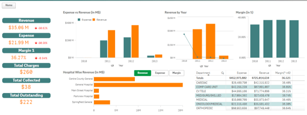
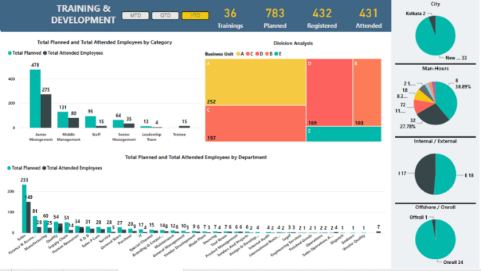
Sample Dashboards
Workforce Analytics
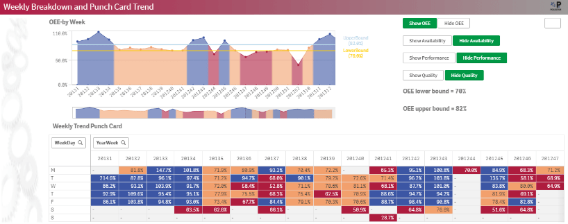
OEE- Overall Equipment Efficiency for Machinery
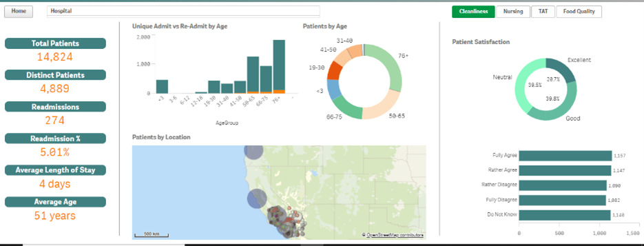
Hospital Data Analysis
In case you want to look at other visualizations for other functions and industries, you can take a look at our solution template.
Applications of Analytics in Pharma
Though we’ve covered the applications of pharma in visualization above, it is not the end of the list. There are more and more use cases being created for pharma in both analytics and visualization every day. For example, you can look at the infographic below:
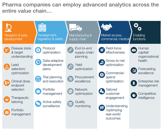
Analytics can help with all the functions across the supply chain with Research & Development, Manufacturing, Supply Chain, Commercials, Finance, Functional enablement, and more.
Now that we’ve studied the why and the how let’s talk about the what also. By now you must have understood the need for and importance of analytics and visualization in the pharmaceutical and life sciences industry. So, let’s look at the multiple ways in which you can make and leverage the dashboards:
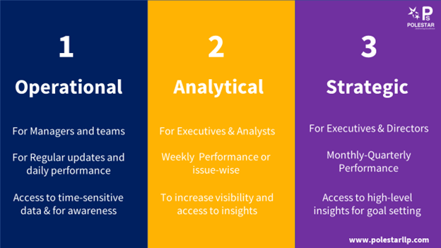
Operational Dashboards: These dashboards are for improving visibility into the operations on a day-to-day basis, therefore useful for the short term. These dashboards are mostly used at the managerial level to analyse operations.
Analytical Dashboards: As the name suggests these dashboards are used to present the analysis of the data captured. These are generally used by executive-level employees and data analysts.
Strategic Dashboards: Strategic dashboards cover the high-level KPIs and updates of the data and are useful for decision-making and goal-setting in the long term. These are normally for C-suite executives.
Even though these are broad terms and their uses, there is no hard and fast rule as to who should use what, it ultimately depends on the industry, organization, and the levels of hierarchy. You can also add other kinds of dashboards like a tactical dashboard, which is useful to track performance.
Here’s an infographic summarizing what the dashboards stand for and how you can leverage them for your organization.
People like seeing things rather than reading lengthy paragraphs and tables. Make your data interesting with charts, graphs, bars, and more. Give your data the space to breathe and help your executives work on your data right from production & clinical trials to inventory management and supply chain management. If you’re interested in Pharma Analytics and Visualization, we can help you with it!
P.S. If you’re interested in knowing more about designing dashboards you can refer to our blog with best practices for Power BI Visualizations.
About Author

Data & BI Addict
When you theorize before data - Insensibly one begins to twist facts to suit theories, instead of theories to suit facts.
Related Blog
.png) Aishwarya Saran
Aishwarya Saran