 SudhaData & BI Addict
Sign up to receive latest insights & updates in technology, AI & data analytics, data science, & innovations from Polestar Analytics.
Editor’s Note: This article covers in detail the 7 best practices for creating the best Power BI dashboards, touching on crucial aspects like Power BI dashboard layout, color schemes, context, and choosing the right visualizations. It also includes a few Power BI Dashboard tips and tricks to help you design more impactful and user-friendly BI dashboards.
(P.S. You can apply these Power BI best practices to other BI platforms too).
Brace yourselves for seeing a lot of images and BI dashboard examples. This is not for the “boring-hearted”.
For starters, let's examine what a good Power BI dashboard examples looks like:
If you are aspiring to make such dashboards. Keep reading.
P.S. If you are aware of what BI is, what some of the most used business intelligence tools are, and just want to know more about how to acquire dashboard design best practices you can skip this next section.
Amongst the most known BI tools in the market, the leaders are Power BI, Qlik, and Tableau. Even among these powerful business intelligence platforms, Power BI is a leading self-service BI tool. It has been named as a leader in the Gartner Magic Quadrant for Analytics and Business Intelligence Platforms for nearly 17 years.
Plus, learning about dashboards or visuals is kind of encoded in our DNA. We mean the idea to understand visually displayed things better, plus it enhances retention and makes the data easier to grasp. Even with generative AI in the picture, for analytics the end results are seen in graphs and visuals.
Therefore, let’s talk about creating the best Power BI dashboards and getting familiar with it, as is important as any of the stakeholders throughout functions might be using it.
P.S. You can apply the concepts to other dashboards too, but keep in mind that the space for presenting the graphs i.e report area and some of the features would be different.
These best practices to make dashboards cover elements of the major three types of BI dashboards, including Power BI dashboard design best practices, namely:
Without further ado, dive into the 7 best practices of Power BI dashboards:
Think about it, would you want to present the Sales of the models and different colors of cars to the financial officer? This data would be more relevant to the sales experts. An effective dashboard would be one that clearly communicates the message to the end user.
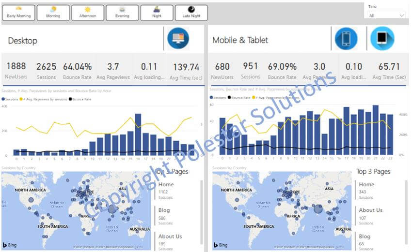
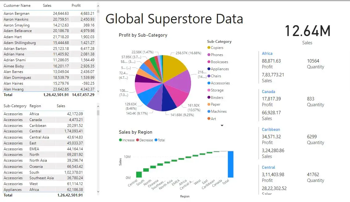
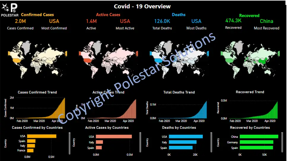
For example, take a look at the Sales Dashboard below:
At first glance, you can see the total sales and color coded sales-wise geographies. Then you can see the best-selling categories and products. Even without drilling too much into details, you can see the high-level overview of the sales after which you can use the filters and drill down into locations – channels – category as per your need.
What this clearly shows is the intent of the dashboard – which has been made for a Sales executive i.e. the end user in mind. So, before you start making the dashboard, ask yourself one simple question- “Who is going to consume the dashboard?
You now have the end user in mind for whom you are making the Power BI dashboards for. This means you also have the data and possibly the KPIs you want to highlight. Now, you might have questions like:
Since you have a fixed amount of data or space that you want to utilize, maximizing the visual perception of the end-user is crucial.
Look at the image below for a crisp blueprint for the hierarchy.
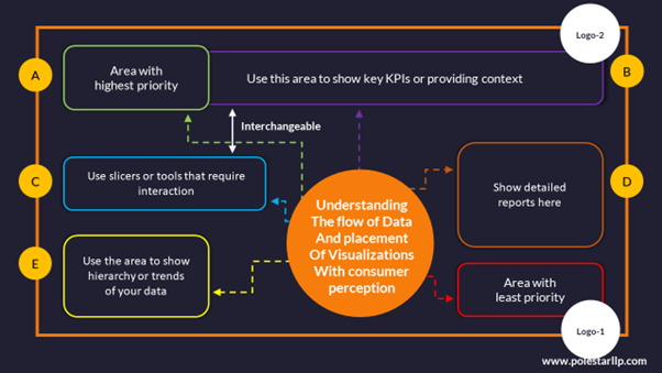
This is based on the fact that users usually follow a Z-pattern or F-pattern of reading (top-left to bottom-right). And that they glance through for quick comprehension first.
Also, though this is a rough outline, please note that the nuances can change based on the specifics of the dashboard.
Next, understand some of the power bi dashboard design principles like Proximity, Similarity, and Enclosure. Let’s break it down with the help of the first dashboard you’ve seen above.
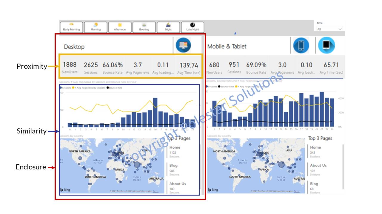
Proximity here refers to grouping elements of similar use together or based on their location. Similarity means using the visual perception of the audience by grouping similar ideas, fonts and colors together. And ultimately Enclosure, which essentially means showing physical demarcation by a visual border or shading to make them a part of a group.
Finally, a few practical recommendations while making the dashboard:
Even after so much thought, there is still the process of choosing the right data visualization tool. As we mentioned above, the human brain digests visual information more effectively than text. So, while you’re working with your dashboard it is important to display it in a way that resonates with your audience. Check out our summary which will help you decide what type of chart can be used based on 5 types of data usage, which are:
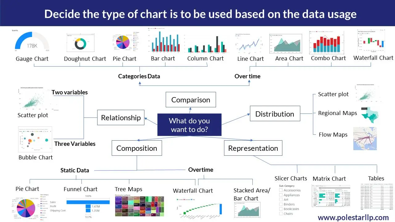
Now you are equipped with the knowledge of which visualization to use based on your data but always remember – “Who is going to consume the dashboard?”. The whole purpose of dashboards is to simplify information and not complicate it with fancy or complex charts which might cause information overload. (In other words, not everyone can understand stacked or waterfall charts)
Must read: If this is what you are confused with and want more elaboration as to how when and where to choose the right data visualization type, then we have an e-book just for you. In this, we cover the aspects of choosing the right visuals for dashboards based on available data, functions, types, etc.
To analyze the role of data in specific dashboards the two important on-screen parameters are
BI Dashboards and Visual representation which lack these two parameters will limit their ROI. For example, take the Sales dashboard below:
What do you think this data intends to convey? Sales Data? We can understand this based on the 1 KPI of Sales but what else? There is no context of the time period in which the data is presented. Some data also shows the profit, so, is it for the Profit of the various regions? There is no way to guess. Coming to the labeling, half of the labels are hidden or improperly shown.
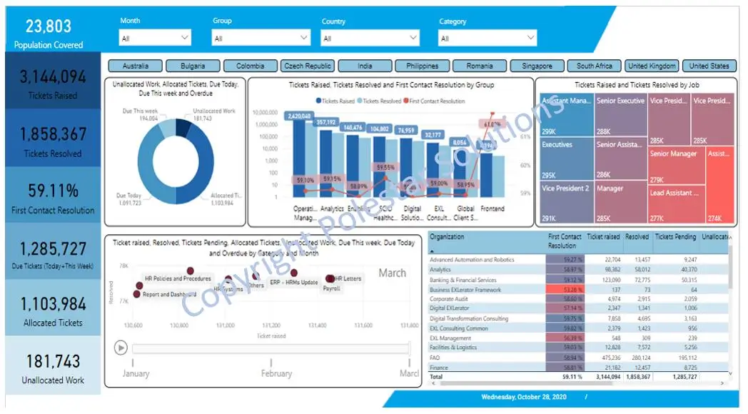
Let’s not try making dashboards like that. Have clear labels as to what the graphs signify to have a clear overview of what you’re trying to convey. For example, the dashboard below clearly shows:
It also uses most of the principles we’re talking about now.
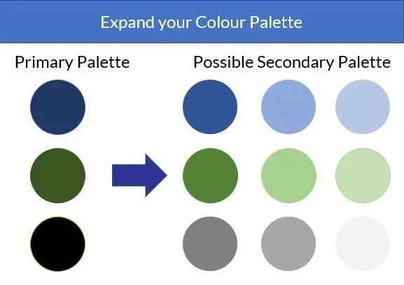
Normally dashboards are made with a lighter background for the flexibility it provides with colors. But with people having digital fatigue growing increasingly, the use of darker backgrounds is being preferred for the comfort it provides. But colors with higher contrast also cause discomfort and create a sense of urgency. So instead of having black and white which have high contrast, try to increase the range of your color palette by using colors that fall in the intermediate range by changing the saturation and brightness. Check out the possible colors below:
And please note Don’t use too many colors to beautify the dashboard. Use Red and Green only to show negative and positive respectively and not otherwise. Or use gradients from Red to green or of one color to show the effect instead of using many colors.
With all this knowledge in mind, the one tendency we might have is to show all the possible data such that nothing gets left out and the user can understand what they would want from the data. This notion has two main disadvantages:
This would never be the end goal of the designer of Power BI dashboards. So, to avoid data clutter in addition to the principles of Proximity, Similarity, and Enclosure, as mentioned in Point 2, continuity and connection, are important. For example, look at the dashboard below:
There is a connection between all the data represented by going through different phases that one might find necessary using the same data for various parameters and showing continuity across the values.
This practice is a very short and important one. When you focus too much on the beautification of the dashboard you might lose sight of its usability. So the next time you perfect your power bi dashboard design, try testing it with the end users. This would also keep the end-users in the loop about the progress and workings of the design.
If you are reading this, Congratulations on making it this far!! We are sure you must have at least one takeaway from the data. But again if you still feel you want to know more, keep reading!
Bonus Tip #1 - Use Add-Ons
This advice might not sound new to you but Power BI has an amazing database for the add-ons it provides. Some add-ons in Power BI that one might find useful are Word Cloud, Correlation Charts, Pareto Charts, Natural Language Insights, etc. and these are just the tip of an iceberg. Look at the Power BI Dashboard design below:
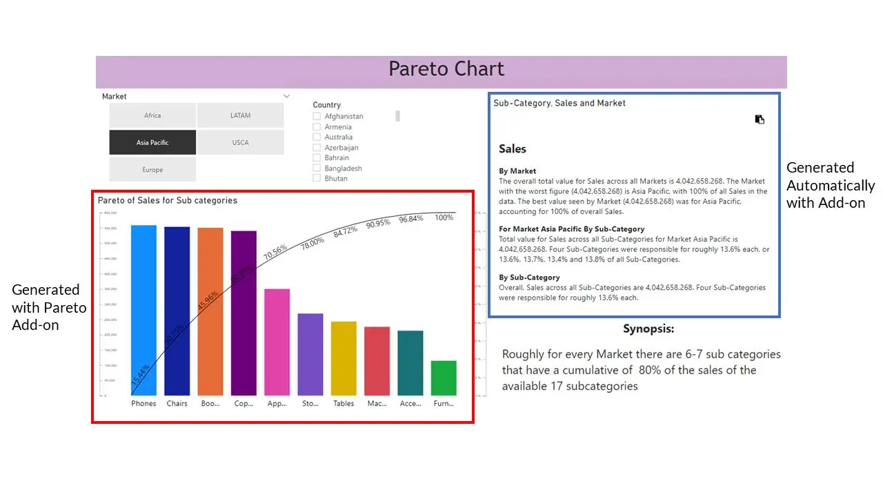
Why write the synopsis when you can directly make Power BI Add-ons do it for you. And think about what the user would understand better. For example, of the two options below:
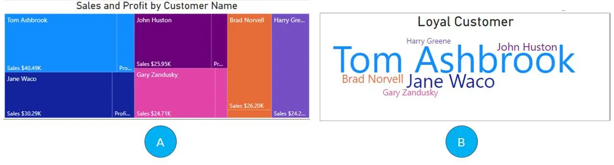
Personally, I would prefer Option B as it shows the size of the Loyal Customer proportionate to the Sales of the person and it is easy to compare more than the TreeMap of Option-A.
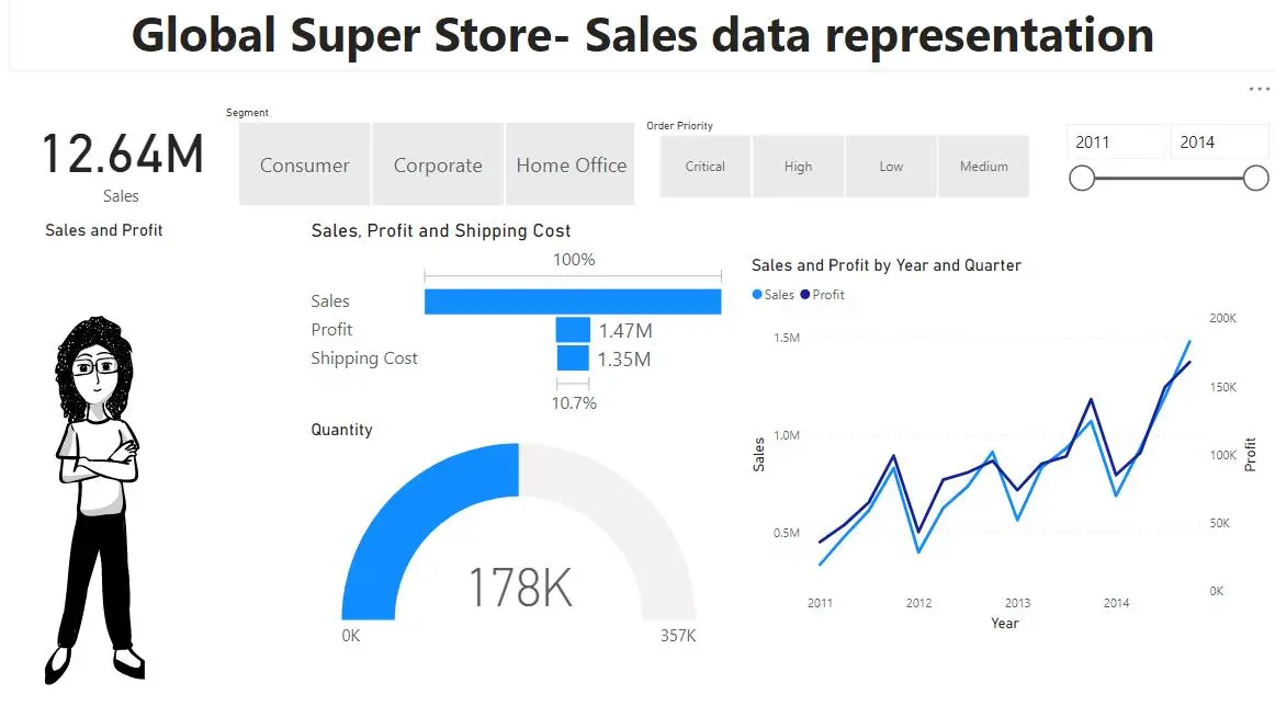
Bonus Tip #2- Use Images In The Dashboards
Take two examples that we have discussed in this blog, Financial dashboard, and Google Analytics Dashboard. Both have images in them which help them understand the context without needing to go through a lot of content. Or you can use comics like the one below (which changes expressions with the data. Sounds interesting right? Try- Comicgen)
Bonus Tip #3 – Make good use of Filters and slicers
For example, in the beverage dashboard that we showed above, the level of filters can be extensive covering the clusters, market, area, distributor, brand, and sub-brand. Instead of just focusing on the visuals you can also make use of filters to ensure effective drill down.

The key to making the best Power BI dashboard revolves around the thought of what would the intended user need. All the other practices are support activities for this thought. And one last tip- Stop Thinking and start practicing.
If you want to know more about the Components of a good dashboard, you can learn more about power bi dashboard design best practices here.
If the answer is yes, then you are looking at the perfect Power BI implementation partner. Just go through our various use cases. We provide Power BI Consulting services and also support for all the versions including Power BI Embedded (P.S. We are Microsoft Gold Partners after all)
Or if you are looking for other business intelligence tools like Tableau or Qlik and are having a hard time choosing, we can still help you.
If you were intrigued at any point till now, Contact us.
About Author

Data & BI Addict
When you theorize before data - Insensibly one begins to twist facts to suit theories, instead of theories to suit facts.
Related Blog
 Bhaskar Pathak
Bhaskar Pathak
Bhaskar Pathak