 Tushar SonalInsights Explorer
Sign up to receive latest insights & updates in technology, AI & data analytics, data science, & innovations from Polestar Analytics.
Well-designed dashboards are prized assets for an organization. An analytics dashboard design acts as a snapshot of the management. They give a high-level view of the business, department, or a specific process without getting the user caught up in a mesh of numbers and figures. They engage the power of visual perception and are supposed to communicate a dense collection of facts efficiently and with exceptional clarity.
Well-adopted dashboards result in analytics adoption, thus setting up a paradigm of data democracy within organizations. Despite such promises, few organizations get their dashboard design right. When dashboards suffer from low user adoption, it limits the value of analytics to organizations.
The concept of a business dashboard draws strong parallels to an automobile dashboard. The automobile dashboard displays important status indicators such as speed, fuel gauge, etc. It alerts the driver with issues. This assures the driver that the engine health is right without presenting the driver with detailed engine information which might lead to critical information being overlooked. Similarly, a business dashboard answers questions that are critical to its audience.
Let’s see how the design is flawed and what are the common mistakes one makes.
For example, while designing the dashboard one is tempted to present an exhaustive list of information. This is done to ensure that the dashboard is not missing out on any useful metric that the user might consider important. However, it may lead to an uncomfortable user experience when the dashboard gets cluttered with too many widgets and densely presented information. This can become difficult for the user to derive meaning from, like the tables on the left.
Often, dashboards are filled with over-the-top visualization styles to deliver information in fascinating styles. By including newer and advanced charts and graphs, they can deliver a top-notch visual experience. But, if the users are not trained to use these visualizations, they may regard it as a glitzy interface with little value. They will instead prefer their older but more reliable reporting systems.
Many times, dashboards are not aligned with the user persona. Dashboards are created without thoroughly understanding the user requirements, expectations, and skills. In this case, the dashboard may present the user with information that will be deemed irrelevant. Such a dashboard is not targeted and will fail to tell a convincing story. When this happens, the new dashboard becomes another not-so-useful piece of an upgrade. So before designing your dashboard ask yourself this question - Who is the intended audience?
Learn the best practices for creating Power BI dashboards that are effective, informative, and engaging.
READ MOREAnalytics projects are costly and time-consuming and dashboards are the face of the application. A poor dashboard design has the potential to undermine the value of analytics projects for your organization and is one of the reasons why people revert back to old methods like Excel.
There are two important aspects to having the best dashboard design. The first aspect is maintaining the visual appearance of the dashboard, where we have to keep in mind the placement of different elements depending on the similarity or the usage by the end-user.
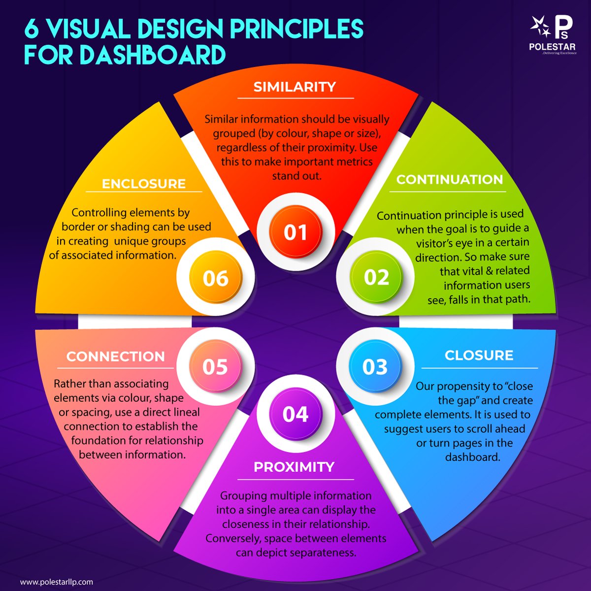
The infographic below sums up six design principles for the Visual design of the dashboard.
The second aspect, of the storytelling process and determining what to show on it. Here we recommend a few best practices that good dashboards design share in common. Well-designed dashboards will ensure that they will act as a single source of truth for relevant information across departments and processes.
1) Identify The Dashboard User's Persona
An effective dashboard can only be built after an in-depth understanding of the audience that is going to consume the solution. That will determine the level of information that is going to be displayed. Understand the current analytics skills and user expectations from the solution.
Always ask yourself this question- Who is the dashboard intended for? Some users will prefer the dashboard to display ready-to-consume information with KPIs and basic visualizations. While others will require a much more detailed summary with the facility to create data filters, slice & dice, and drill-downs built into the solution.
CXOs expect their dashboard to present a crisp summary of broad company-wide performance metrics with key trends. Any extraneous information will be considered unnecessary. Mid-level managers will expect their dashboards to show a detailed analysis of metrics. It should have an interactive interface with drill-downs that allow a deeper exploration. Some users will ask for detailed operational reports. Power users would like to have a dashboard that allows them to do their own data discovery and hence such dashboards should be customizable.
Before choosing a dashboard design, perform extensive user research. Understand your user goals within the different hierarchies, departments, and Lines of Business. Identify which KPIs are most important to them. After this, identify the most relevant visualization style that will best convey the information.
For example, in the dashboard below the sales data is being represented for high-level management so the KPIs along with slicing and filter options have been shown.
2) A Good Dashboard Informs The User With A Story
Dashboards are the face of the analytics application. The ones that tell a story are the easiest to comprehend. Such dashboards give a seamless experience to the user and encourage conversation. They are easy to navigate and deliver an impact. To make the information easy to comprehend, it should be presented with an inverted pyramid structure. Include the most important information at the top.
The user should be presented with an increasing level of detail as they go below. Comprehensible color codes should be used to display alerts on whether goals are met. The RAG framework communicates important information and alerts in a very easy-to-interpret manner. The dashboard must answer “why” something occurred and not just “what” is happening.
3) The Ideal Dashboard Has A Minimalistic Design
A good dashboard captures the essence of data. Presenting information with extra charts and widgets has a definite appeal. However, extraneous information might divert the user’s attention from the really important information. Our experience suggests that there should be 4-6 widgets on a single page.
Pay attention to keeping the widget sizes in the correct proportion. Group charts that represent similar trends together. A simple dashboard design that presents information neatly. It is easy on the eye and ensures that the dashboard can be read at a glance.
“The best software for data analysis is the software you forget you’re using. It’s such a natural extension of your thinking process that you can use it without thinking about the mechanics.” – Stephen Few
4) Keep Evaluating The Evolving User Expectations To Improve
Analytics implementations are never a one-time shot. Over time, the scope of analytics keeps on increasing. More processes and people start to realize the benefits and come up with ways to make it even better. Delivering the perfect dashboard must also involve cycles of constant feedback and improvements.
Remain agile and look out for any red flags that users throw up. It may happen even after the dashboard is set up and running. Have regular discussions with the teams that are actively using analytics. Gather their suggestions for improvements and incorporate them into the dashboard design.
Effective dashboard design is an important component in successful enterprise-wide analytics. Meaningful user experience with your dashboard can boost analytics adoption. This helps the user navigate through the information to listen to the story that the data is telling and take proactive actions.
This will lead to far-reaching benefits and improved returns on your analytics investment. By following the principles outlined above, you can ensure that your dashboards will be well adopted. While the biggest differentiation comes with the right implementation, you must also ensure that you identify and choose the right analytics tool that doesn’t restrict you from the capability perspective.
Still thinking about what and how to build a story through dashboards, start practicing with research thoroughly based on your requirements. Some excellent visualization tools in the market are Qlik, Microsoft, and SAS. You can read the details about them here. Or talk to us and we will help you in understanding what would be the best BI platform for you.
Want to see how Polestar Analytics delivers top-notch visualization dashboards by partnering with the market leaders?
About Author

Insights Explorer
If data is oil, then analytics is the combustion engine of this current era.
Related Blog
 Debadutta
