 SudhaData & BI Addict
Sign up to receive latest insights & updates in technology, AI & data analytics, data science, & innovations from Polestar Analytics.
Polestar’s 3 Key Takeaways for Data Visualization & Dashboards for CPG in AI era:
The State of AI in Retail and CPG report of 2024, by Nvidia, talks about how the highest potential for AI impact is in the consumer packaged goods market especially in enhancing the operational efficiency, elevating customer experiences, and driving growth. But it is not just the custom use cases and solutions that AI has improved, the entire Data to Insights lifecycle of CPG along with BI has been impacted.
At the end of the day, we, humans are still visual beings. Even when we’re asking the questions to a generative AI-enabled chat bot, the answer might still end up being a visualization. So, why not understand the nuances to know how to deal with it?
The first step in your visualization journey starts with KPIs. Knowing what you want solves half the problems? (though working on it is the tougher half)
A few KPIs that CPG industry dashboards can have at an operational and analytical level are:
Some of the KPIs for strategic and financial teams are:
These are just a few of the KPIs that are useful for the FMCG or the CPG industry. But obviously, these are just an example there might be simpler or complicated insights you might be looking for.
In case, you are not sure about where to start, then one of the best processes would be to identify Acceptable, Advisable, and Admirable KPIs suitable for your CPG business. If you are unsure about the same, drop us a message and our CPG Analytics experts can help you with the same.

Access our interactive Procurement KPIs Periodic Table
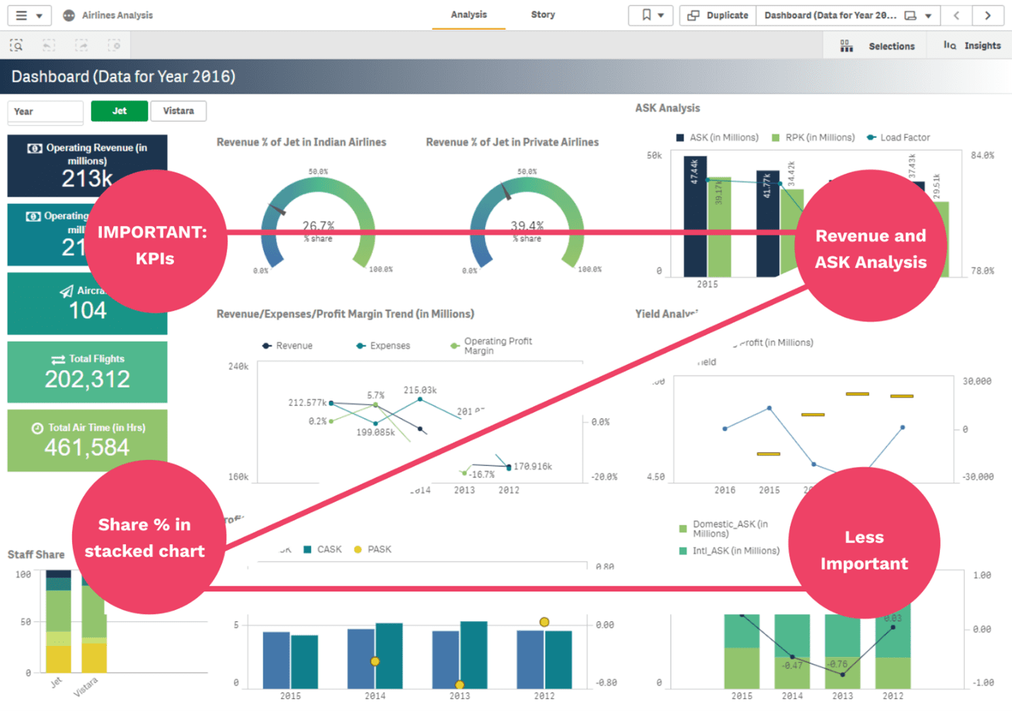
Know What KPIs to TrackNow that you’ve decided on the content or the type of content you want to show, next comes the structure and the placement of the KPIs. Normally, users follow a “Z” pattern in reading therefore the most important KPIs should be placed first and the not-so-important ones at the bottom, like the one in the dashboard below:
Here’s a few tips for visualizing CPG data (in addition to the data and KPIs that have to be represented):
Also, it is important to know which type of chart to use when needed. Usage of Pie charts, bar charts, stacked charts, combination charts, waterfall charts, etc. can create confusion when the user is unaware of how to read the charts. Therefore, it is important to maintain charts as simple as possible but also to convey as more information as possible. Here’s a cheat sheet in case you were looking for one.

Looking for more tips in choosing the right visualization?
Master the art of data storytelling with visualsThe future is going to be a blend of traditional tools with AI, it will be the same with visualizations and agents too. Take our generative AI enabled bot for example:

The best way to get the most out of such agents and bots is, to obviously have the quality data management practices, especially creating and maintaining the semantic models for generative AI purpose. Let’s take 5 examples of in CPG industry:
| Element | Consideration | Description | Example |
|---|---|---|---|
| Dimension tables | Creating supportive descriptive data | Create dimension tables that contain the descriptive attributes related to the quantitative measures in fact tables. | Creating clear labels that talk about their data: "Product_Details", "Customer_Information" or create meta data that is descriptive. |
| Product Hierarchies | Natural Language Mapping | Structure product hierarchies using consumer-friendly terms that match how people naturally ask questions about products | Map "Carbonated Soft Drinks > Cola > Diet > 12oz Can" instead of using internal codes like "CSB-COLA-D-12" |
| Category Definitions | Market-Aligned Groupings | Define categories based on how consumers and retailers view products, not internal classifications | Group "Sports Drinks" and "Enhanced Water" together since consumers often compare these, even if internally they're separate divisions |
| Sales Metrics | Consistent Unit Definitions | Standardize how you measure product volumes across different package sizes and formats | Define "unit sales" consistently - e.g., always use "equivalent cases" where 1 case = 288 fl oz across all package types |
It is also about embracing the intelligence out there. For example,
The examples are not just limited to visualizations, you can use AI agents for automatic anomaly detection – instead of waiting for humans, you can trigger agents for early detection of anomalies, and more.
We understand that all this might sound very tedious, right from enabling the data management to creating the supporting CPG applications that enable decision making. So, we’ve introduced 1Platform which is an ecosystem that supports CPG Data visualization and AI seamlessly.
The short version of it is you can access everything you need right from AI enabled applications to AI enabled dashboards from the same place.

With 1platform we eliminate the need for searching multiple reports but instead our navigation-led Insight Portal, we give you a very clear demarcation about what you should be looking for.
It’s similar to having separate tabs for visualizations like: Shipment vs Depletion or a Sales overview tab.


You can drill down further based on your requirements.
Or will they be so embedded into our workflows that we barely notice it anymore? Or some mixed version of it? We’ll have to see.
But in order to adapt to the AI era, you need to move quickly!!!
Talk to our AI & BI experts today to discuss your requirement further!!
About Author

Data & BI Addict
When you theorize before data - Insensibly one begins to twist facts to suit theories, instead of theories to suit facts.
Related Blog
 Debadutta
 Bhaskar Pathak