Sign up to receive latest insights & updates in technology, AI & data analytics, data science, & innovations from Polestar Analytics.
Editor's Note: In the ever-evolving landscape of business intelligence, certain tools have emerged as true heavyweights in the realm of self-service BI. This blog post takes an in-depth look at three powerhouses: Power BI Vs Tableau Vs Qlikview/Sense. Discover how these robust data visualization platforms empower organizations to harness the power of data, drive informed decision-making, and unlock valuable insights.
According to Stephen Few, a data visualization consultant at NASA – “ Data visualization shifts the balance towards greater use of visual perception, taking advantage of our powerful eyes whenever possible”.
With so many self-service data visualization tools available in the market, which one should you pick? Well, let us help with that, we compared the three market leaders —Microsoft’s Power BI vs Tableau vs Qlik Sense—on several parameters to help you decide the better one for your organization.
In the present scenario, the responsibility for analytics has shifted from IT to business analysts, with support from database administrators and data scientists. As a result, BI has changed from generating monthly reports from the system of record, to interactively discovering, sharing forecasts, and answering to business questions based on data from a wide array of internal and external sources. Instead of making decisions in months, businesses that have adopted self-service BI tools in place can decide and take action in a few days.
But figuring out which self-service BI platform is suitable for your organization can be a tricky task. The best fit will be determined - from your business users’ point of view and your IT infrastructure.
Microsoft Power BI, Tableau, and Qlik Sense are the heavyweights of self-service BI. Here we take a look at these three data visualization tools, their differences, and what factors might be important in determining which one is better for your organization.
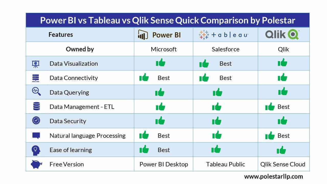
Before we delve into details of each of the Visualization tools, just note that all the three tools Power BI, Tableau, and Qlik have their free versions, like Power Bi has Power BI desktop which comes along with its Office package. Tableau also has its Tableau Public which is free but the dashboards are accessible through its website to the public which is similar to Qlik Sense Cloud. This is other than their pro, cloud, and enterprise versions which are also discussed below.
Microsoft introduced its visualization tool in 2015 and named it as Power BI. Since its inception, it has been consistently recognized by the leading technology research firm- the Gartner magic quadrant. Currently, Power BI is offered along with the office 365 suit to further add to its popularity.
It has become very popular among business analysts in small and big organizations. Someone who has profound knowledge of excel mostly prefers Power BI as a business user, and technical users are prone to adopt Microsoft office stack. When it comes to build and display, Power BI is the most suitable data visualization tool as if offers visual-based data discovery, data preparation, interactive dashboards and augmented analytics.
It is available as- Power BI Reporting Server (PBRS) option or as a SaaS option running in the Azure cloud in Power BI Report Server. It is user-friendly, and you don’t have to put more time and effort into creating and sharing reports. When talking about the cloud, Power BI requires no such investments or infrastructure support, but for on-premise, you will need support regardless of the size of the organization.
Let’s look at some of the key features of Power BI, which makes it stand out in the competition.
Attractive visualization and powerful data modeling
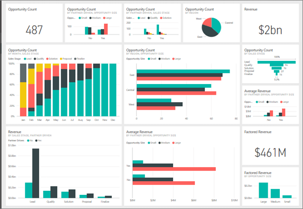
One of the prime features of Power BI is information dashboards which can be personalized to meet an organization’s exact needs. BI reports can be easily embedded into dashboards for enhanced user experience. You can effortlessly create in-depth and interactive visual analysis to create powerful data storytelling and lead your business users to do data discovery. You can choose from both in-built visuals or community-created custom visualizations. With perfect data visualization tools, you can efficiently perform drill-downs and drill-ups.
As far as data modelling is concerned, Power BI has a query editor, an integrated ETL tool that helps you to shape data from multiple data sources to create robust data models. It has a powerful Data engine that is well-suited for complex enterprise use cases. Power BI is also integrated with Python and R language for advanced analytics, visualization, and data mining.
Engage your visual perception and learn how to represent data and tell a good story through your data
Seamless Integration with Applications
Being a Microsoft product either cloud or on-premise- the integration with Power BI is seamless. Users get more architectural options around integration. Power BI integrates easily with both legacy and modern enterprise applications, for influential self-service analytics and reporting capabilities; and leverage all available data in a visual manner quite easily. It comes with various in-built connectors which help to easily connect and join multiple on-cloud, on-premise, and streaming data sources for data preparation. It also supports integration with Cortana, Excel, and other applications and services. It allows you to take out dumps from Power BI in the excel format to go ahead with further analysis, which makes it very easy to work together with Excel and Power BI.
Robust Access control and Security
Power BI has set the industry data standards with compliance verified by third-party audits and certifications. With built-in governance, Power BI offers row-level security which grants the ability to assign access rights at various levels. It keeps your data secure, giving people access to the data and insights they need. You can securely share the insights within or outside the organization over email. And this simplifies data management and ensures that your data assets are protected.
DAX for balanced performance
DAX (data analysis expressions) scripting language refers to expressions for making calculations. Power BI uses DAX expressions for creating data models to maintain simplicity and balanced performance. It is a language developed by Microsoft to interact with data in a variety of their platforms like Power BI, PowerPivot, and SSAS tabular models. Users can compare it with Excel formulas. Using DAX will truly unleash the capabilities of Power BI.
SaaS offerings
Power BI comes with a structure of scalable and flexible SaaS offerings. The best part of using Power BI is that there is no usage license fee with installation and no configuration costs. Users don’t need to worry about updates at regular intervals. As per your usage, with Power BI, you can easily upscale and downscale on your investments as needs and requirements change. This really saves you time to benefit from your purchase.
You don’t have to manage and maintain expensive servers. Users don’t need to be concerned about downtimes and interruptions. This makes it a very cost-effective solution for your enterprise requirements.
Solid product roadmap ahead
Microsoft’s Power BI has extensive features that can be added as the organization grows in its BI journey. With a monthly release cycle, relentless enhancements are made available. Microsoft keeps a close watch on requests concerned with the features and prioritizes those most widely requested. Microsoft Power Bi licenses come in different flavors- Power BI- Pro, Power BI- Premium, and Power BI- Embedded.
There are numerous Power BI communities available to users and admins which provide solutions and suggestions to a wide range of problems. So, If you are looking for a realistic estimate & execution plan in line with your enterprise needs, then get in touch with Polestar Analytics.
Let us help you choose between Tableau vs Power BI vs Qlik by understanding your organization's requirement
Top Industries Using Power BI

Tableau Software is an American computer software company founded in 2003 by Christian Chabot, Pat Hanrahan, and Chris Stolte, in Mountain View, California. The company is currently headquartered in Seattle, WA, USA. On June 10, 2019, Tableau was acquired by Salesforce in an all-stock deal worth over $15 billion. Customers have a fanlike attitude toward Tableau.
Tableau is an enterprise-scale business analytics platform with self-service capabilities for users. With Tableau’s easy-to-use dashboards, organizations get an interactive interface with a depth of colors, & visualization options, along with the robust analytics engine that delivers game-changing business insights on their data – fast. Tableau enables users to combine large data sources and access them with speed, reducing the reliance that they used to have on their IT team for reports. Tableau can be accessed with secure & native applications on both Android and iOS.
If your chief objective is to have data visualization tools in place, then Tableau should be your choice. Tableau is one of the popular visualization software in the market for Business Intelligence and self-service analytics platforms. It offers easy deployment options, product support and product usability. It also gives users- Tableau community options to further make the work easy. Flexibility is offered by Tableau while designing dashboards.
Tableau is solely built for interactive visuals believing in the ‘seeing and exploring’ philosophy. Tableau is designed to quickly answer any question asked by the user about its data by quickly manipulating it with the help of tools available. It offers much more than only generating reports. Let’s look at some of the main features of Tableau.
In-Depth Insights
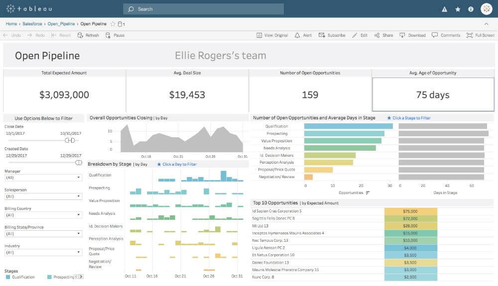
Tableau can help organizations to analyze data without any specific goals in mind. You can easily explore and visualize your data from different angles. You can frame ‘what if’ queries and work with data by hypothetically visualizing it in differently and dynamically adding components for comparison and analysis.
Work with different data sources
During analysis, you may draw data from different sources, for instance, the cloud, spreadsheets, Data Warehouses, etc. All of this may not give you the same level of granularity. The data blending feature of Tableau will help you blend all the data in the visuals while keeping them apart at the source. This method not only speeds ups the process of combining data from multiple sources, but it also negates the need for priming the data before processing it to create the visuals.
Real-Time Data Analysis
Data that is changing fast. With Tableau, you can make live connections with the database. When new entries are added or the database changes, you can refresh in tableau, and all changes will be reflected on your dashboard. You can also set the data to refresh at specific time intervals. This feature will help you draw valuable real-time insights.
Drag and Drop Clusters
This is the most powerful feature of Tableau, which allows you to combine similar group members. Now the question arises why you would group them? Grouping them gives you statistical information which will offer you an insight into how different groups are similar and compare their performance with each other for segmentation analyses.
Collaboration
You don’t work in isolation. When you analyze the data, you have to share it with the team or with the entire organization. Tableau allows you to share the dashboard with multiple users, and this feature will help you share your conclusions too. This feature is very advantageous to collaborate as a team.
Tableau Online
Tableau Online is a fully hosted cloud solution that empowers an instantaneous setup and simplistic scalability for enhancing business growth. It is a data visualization platform where you can easily publish dashboards and share your discoveries with anyone. You can also invite customers or colleagues to explore hidden opportunities with interactive visualizations and accurate data. Users can easily accessible from a browser or on the go with our mobile apps.

Headquartered in Radnor, Pennsylvania, Qlik is the leading visual analytics platform and the pioneer of user-driven business intelligence. Its portfolio of cloud-based and on-premise solutions meets customers’ growing needs from reporting and self-service visual analysis to guided, embedded and custom analytics, regardless of where data is located. Customers using Qlik Sense, QlikView and Qlik Cloud, gain meaning from information from multiple sources, exploring the hidden relationships within data that lead to insights that ignite good ideas.
Qlik is a fully integrated cloud-ready platform powered by the patented QIX associative indexing engine. Qlik's Associative engine brings together all your data so you can explore without limits. You'll call it the most powerful competitive advantage in a data-driven world.
With its intuitive visualization and exploration, advanced analytics, and self-service data preparation abilities, Qlik Sense combines enterprise governance and readiness, which allows organizations to meet the range of BI use cases from a single platform leading to data-driven decision-making.
Now, look at some of the significant features of Qlik Sense:
Smart Visualizations and Analytics
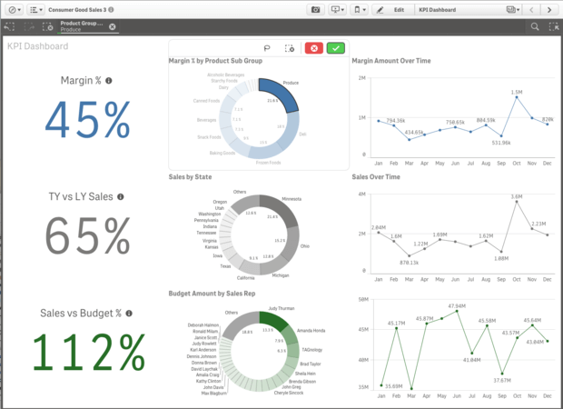
If we talk about data visualization tools, Qlik sense is more than that. It offers advanced and smart visualizations that help in analyzing the data in a better way. The visualizations are interactive and respond quickly on the made selections. The graphics are of high standards and visualizations are flexible and adjustable according to the size of the screen. Qlik Sense comes with various new visualizations types like- Distribution chart, box plot, and Histogram that helps the users to make better sense of their data. Users can also apply custom coloring filters to data values within the master dimensions, which provides immense consistency in the entire application.
Conversational Analytics and NLP
With its open API’s, Qlik offers integration with natural language generation & processing, advanced predictive analytics, and augmented intelligence. These capabilities allow direct data exchange between third-party and QIX engines for calculations. Using this interface, Qlik has released integrations for R and Python. This permits advanced calculations from external tools to be visualized within Qlik sense. With all these capabilities, users can combine the power of Qlik’s associative model with advanced analytics to support use cases like- sales forecasting, inventory management, and fraud detection.
Data Storytelling and Reporting
Data Storytelling capability is one of the unique and powerful features of Qlik Sense. It provides intelligent and in-context commentary of the data analytics visuals. The entire data story is created by the software to give a perspective and build a picture, presented for the analysis. This is very helpful in drawing impactful insights from the data. With this feature, the apps created in Qlik Sense in the form of reports are printed and exported as- Excel, PowerPoint, PDF, etc.
Mobility
Qlik sense is made for mobility, with native touch interaction and responsive design. It easily explores analytics and collaborates with your team using any device. You build a self-service analytics application once, and it works everywhere. You can also experience fully interactive offline analysis on iOS, and it also supports leading Enterprise Mobility Management (EMM) platforms.
Governance and Scalability
Qlik offers enterprise-class management services that ensure- Data safety, control, monitoring, and centralized management. The centralized data monitoring and management are done through the efficient Qlik Management Console (QMC), which is able to control all the Qlik sense services centrally. Scalability is also one of the important aspects, and elastic scaling is helpful to load and analyze a large amount of data. So, the efficiency with which Qlik Sense can offer Enterprise-level governance and scalability is the dynamic QIX engine.
Attunity and Qlik Data Catalyst (QDC)
In the present hyper-competitive environment, where real-time enterprise data is significant to success, organizations are looking out for a more agile approach to analytics and data integration. Bringing together- Attunity’s data integration solutions with the data management and cataloging solutions of Qlik Data Catalyst. Now Qlik offers customers with a comprehensive enterprise data integration platform to convert their raw data into a governed, analytics-aware information resource. This data visualization platform empowers the movement of data in real-time across multiple cloud environments and data lakes, which when collective with predictive analytics and AI, scales real-time insights throughout an entire organization.
Qlik Insight Bot (QIB)
Qlik Insight Bot offers a fast and easy way to ask questions and discover insights to make data-driven decisions simply by having a conversation. The Qlik insight Bot engages users with each question, it instantly surfaces relevant charts and insights, including key drivers, comparisons, predictions and more. And its self-learning AI makes the system progressively smarter.
Overall, we can say that all tools work on different principles. Power BI is a fantastic asset for quick insights, great user experience, and sharing- within your company with reasonable pricing. On the other hand, if you require a simple interface and beautiful visualizations, Tableau might be your preferred choice.
Last but not least Qlik Sense- Is more than a visualization tool. With its strong ETL engine, that also has connectors that can connect you to any kind of source system like- a database, APIs, etc. So, if you are looking for a pure-play visualization tool, then toss a three-sided coin and decide. Usually, discussions may come more around commercials or individual preferences, but if it is an end-to-end BI and you don’t have anything for your ETL or Data Warehouse, then Qlik is the better fit.
Therefore, organizations should select the best data visualization tools based on their requirements, taking into consideration the above-listed features. Or Contact us and we will help you find the best fit for your organization.
Watch our Webinar where we demo how to convert Qlik View App to Qlik Sense with tips about migration & adoption
About Author

Content Architect
The goal is to turn data into information, and information into insights.